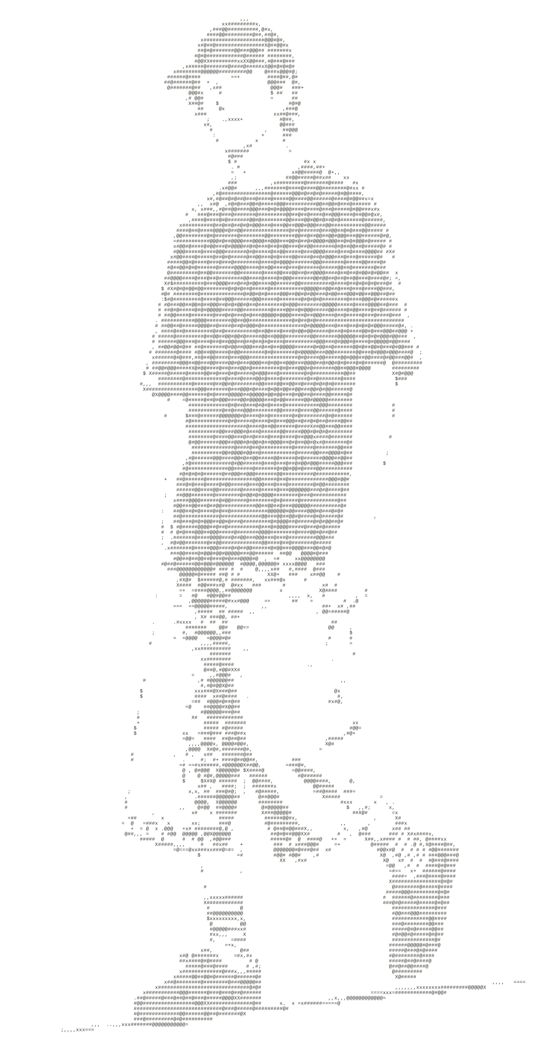
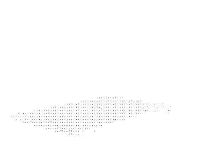
The homepage looks simple: a man walking, a laptop turning, a little red shimmer when the cursor gets close. The route to that simplicity was not simple at all.
First, I had to make a version of me worth animating.
I started with a photograph and used image generation to push it away from a literal portrait. The direction was somewhere between an editorial ink drawing, a game character and a surf-and-skate illustration: oversized black T-shirt, very long baggy jorts, striped socks, plain black shoes, no forced smile.
That sounds like a prompt. It was actually a long sequence of decisions. The early versions were too photographic, too cartoonish, too cheerful, too crowded or just anatomically strange. A sleeve would swallow an arm. Both shoes would look like the same foot. The shorts would turn into a dark column with no gap between the legs.
The AI made material quickly, but it did not make the art direction for me. I still had to say what felt wrong, compare versions, lock the parts that worked and stop changing them once the character felt like the same person.
Before it moved, I converted the approved illustration into the first static B2 ASCII character. That locked the printed texture, the tone and the important empty spaces. This ASCII still—not the original photograph—became the input to Higgsfield.
The tools accelerated the making. They did not remove the taste.
Then the still image needed a believable walk.
I used Higgsfield’s image-to-video workflow to turn the approved ASCII character treatment into a five-second walking sequence. The useful word there is sequence, not animation. A generated clip can look impressive when played once and still be completely wrong for a loop.
The first attempts looked like dancing. The feet crossed in front of each other, the hips swung too far and the body changed shape between steps. Even a good-looking final frame was useless if it could not hand cleanly back to the first frame.
So the direction became deliberately boring: a natural walking pace, restrained arms, a stable torso, the same clothes and proportions, no camera move and no dramatic turn. The job was not to make a cinematic clip. It was to make five seconds that could disappear into a website.
Loop rule
A seamless loop is judged at the join. If the last pose and first pose disagree, the eye sees a reset instead of continuous motion.
Five seconds became sixty images.
I extracted the Higgsfield result at 12 frames per second. Five seconds at 12fps gives exactly 60 frames: enough temporal detail for a walk to feel continuous, but restrained enough to keep the static site manageable.
Each extracted frame was cropped to the same canvas before conversion. This was important. If every frame found its own crop, the character appeared to wobble around the page even when the movement itself was fine. A fixed coordinate system made the body move while the composition stayed still.
The browser does not play a video for the character. It advances through sixty individual SVG files in chronological order. That gave me a clean, transparent result and let every visible mark remain a real ASCII glyph.
The hardest part was not the characters. It was the gaps.
Chafa converted each raster frame into a high-detail character field. I used a fixed 180-column treatment so the density remained consistent across the sequence. More detail was not automatically better: too many dark characters made the shirt, arms and jorts merge into one slab.
The breakthrough was preserving true negative space. The area between an arm and the shirt has to be empty. So does the gap between the legs. Early conversions treated those areas like pale texture, which made the figure look cut in half or glued together. At one point I temporarily filled the intended empty areas with dots simply to prove where the mask was failing.
Once the crop, brightness threshold and gaps were stable, the ASCII started reading as a person from a distance. That is the real test. A technically accurate field of symbols is not useful if the silhouette disappears at website scale.
The conversion target
Not maximum fidelity. A clear silhouette, stable clothes, readable limbs and enough local texture to feel printed rather than pixelated.
The laptop had its own loop.
The floating laptop was built separately because it needed different movement and different timing. It opens, closes and turns more slowly than the walking figure. Trying to bake both objects into one video would have made their scale, placement and loop timing impossible to tune independently.
I ran the laptop through a related pipeline: a controlled green-screen source, a short motion clip, 60 extracted frames and the same Chafa glyph language. Its separate 120-column conversion was tuned for the chroma mask, transparent gaps and lighter display rather than reusing the character settings.
On the page it lives in its own layer and its 60 frames play over a slower 7.5-second cycle. I can move it to the upper left, change its size or slow it down without touching the walk.
Its screen also needed a lighter internal value. Without that contrast, an open laptop read as a dark wedge. This was a small tonal adjustment, but it made the object legible immediately.
The final build is just static HTML.
The page is hosted on GitHub Pages. There is no animation framework and no server rendering. HTML provides the layers, CSS positions and tones them, and a small amount of JavaScript swaps the active frame on a shared timeline.
The red cursor shimmer uses a second copy of each active SVG. CSS colours that copy Routiq red and reveals it with a soft radial mask centred on the pointer. The ordinary grey layer is masked in the opposite direction, so the colour feels like it travels through the characters rather than sitting on top as a hard spotlight.
Desktop and mobile use the same art, but not the same composition. On a phone the type, figure and laptop have less room to negotiate, so their size, opacity and coordinates change. The text always wins. Decorative motion can sit behind it; it cannot make the headline hard to read.
The page also respects prefers-reduced-motion, exposes a pause control and keeps the animated SVGs out of the accessibility tree. The visual has a useful description once; a screen reader does not need to announce sixty near-identical frames.
What I would do again.
- Lock the art before animating it. Every unresolved detail becomes 60 unresolved details after frame extraction.
- Design the loop, not the clip. A great five seconds can still make a terrible repeating background.
- Protect the negative space. In ASCII, the empty cells describe anatomy as much as the printed ones.
- Give objects separate timelines. The figure, laptop and typewriter can then change without destabilising each other.
- Test at the actual size. A beautiful full-screen conversion can disappear when reduced to a pale background figure.
- Keep the delivery boring. Static files, relative paths and a small script made the result easy to host and hard to break.
The finished page is not one clever prompt. It is a chain of ordinary, inspectable steps—with judgement between every one of them.